Creating a consistent interface is much easier when visual decisions are written down as reusable rules. Those rules are called design tokens: named values for colors, typography, spacing, radius, shadows and other UI foundations.
The problem is that a great visual reference rarely comes with its token system. You may have a website you admire, a screenshot from a client, or a moodboard image—but no Figma library, CSS file or documentation explaining why it looks coherent.
This guide explains how to turn that visual reference into a usable starting set of design tokens and how to give those tokens to an AI coding tool without getting a generic result.
What are design tokens?
Design tokens are small, named pieces of a design system. Instead of repeatedly writing a raw value such as #1D4ED8 or 16px, a team gives it a meaningful name and reuses it.
For example:
:root {
–color-brand-primary: #2457D6;
–color-surface: #FFFFFF;
–color-text-primary: #18212F;
–space-4: 16px;
–radius-card: 20px;
–shadow-card: 0 12px 32px rgba(24, 33, 47, 0.12);
}
The tokens are not the complete design. They are the foundations that make a product feel deliberate and consistent across pages, components and future updates.
Why use a design tokens generator?
When building from a visual reference, the usual alternative is manual guessing. You inspect colors one by one, estimate border radii, recreate typography and then adjust everything after the first AI-generated screen looks wrong.
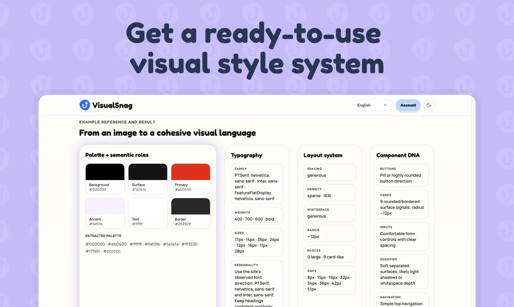
A design tokens generator helps you start with a structured visual brief instead. It can identify and organize the decisions visible in a screenshot or URL:
- color roles, not just a list of colors;
- font hierarchy and readable type scale;
- surface and background treatment;
- spacing rhythm and card proportions;
- border radii, shadows and visual density;
- component patterns such as buttons, inputs and navigation.
It will not replace design judgement. It does reduce the blank-page problem and gives AI tools clearer constraints from the first prompt.
The right goal: a usable starting system, not a pixel-perfect copy
Do not use a screenshot to blindly reproduce another brand. A visual reference should help you understand a design language: the contrast level, warmth, density, hierarchy and component behavior that make an interface work.
The goal is to create an original product with a clear direction. Change brand colors, copy, imagery and distinctive assets. Keep only the transferable principles that fit your own product and audience.
Step 1: Choose a reference with a clear visual system
The best source image is not necessarily the most beautiful one. Choose a page that clearly shows the patterns you want to learn from:
- a hero section and at least one card or content block;
- readable text hierarchy;
- buttons or other interactive elements;
- enough contrast to distinguish surfaces from backgrounds;
- a visual mood relevant to your product.
Avoid a screenshot that is too cropped, overly animated or full of photography with almost no UI. A desktop screenshot between 1440 and 2000 pixels wide usually works well because it shows both layout and details.
Step 2: Extract the visual decisions into token categories
Start by grouping observations into categories. A good initial token set is short enough to use and specific enough to guide real implementation.
Color tokens
Do not create twenty unnamed hex values. Assign roles:
color.background
color.surface
color.surface.subtle
color.text.primary
color.text.secondary
color.border
color.brand.primary
color.brand.hover
color.status.success
Roles make the system adaptable. If the brand color changes later, you update one token rather than searching through every component.
Typography tokens
Capture hierarchy before individual font sizes:
font.family.display
font.family.body
font.size.hero
font.size.h1
font.size.h2
font.size.body
font.weight.heading
line-height.body
letter-spacing.label
If the exact font is unknown, describe its character: geometric sans, editorial serif, neutral grotesk or compact monospaced accent. That is more useful to an AI coding tool than pretending to know an exact typeface.
Layout and spacing tokens
Look for repeated distances. Most polished interfaces use a rhythm such as 4, 8, 12, 16, 24 and 32 pixels rather than arbitrary gaps everywhere.
space.1 = 4px
space.2 = 8px
space.3 = 12px
space.4 = 16px
space.6 = 24px
space.8 = 32px
content.max-width = 1200px
Shape and elevation tokens
Record the character of the UI: sharp and technical, softly rounded, or almost pill-like. Add only the radius and shadow levels you actually see.
radius.small = 10px
radius.medium = 16px
radius.large = 24px
shadow.card = soft, low-opacity, large blur
shadow.menu = medium elevation, neutral tint
Step 3: Use VisualSnag to turn the reference into an AI-ready brief
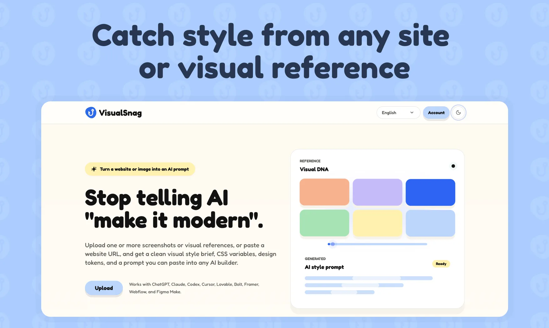
VisualSnag is useful when you have a screenshot or URL but need a structured description of its style. It turns visual references into a style brief, CSS variables, design-token direction and a prompt you can reuse with tools such as Cursor, Claude Code, Codex, Lovable, Bolt or Figma Make.
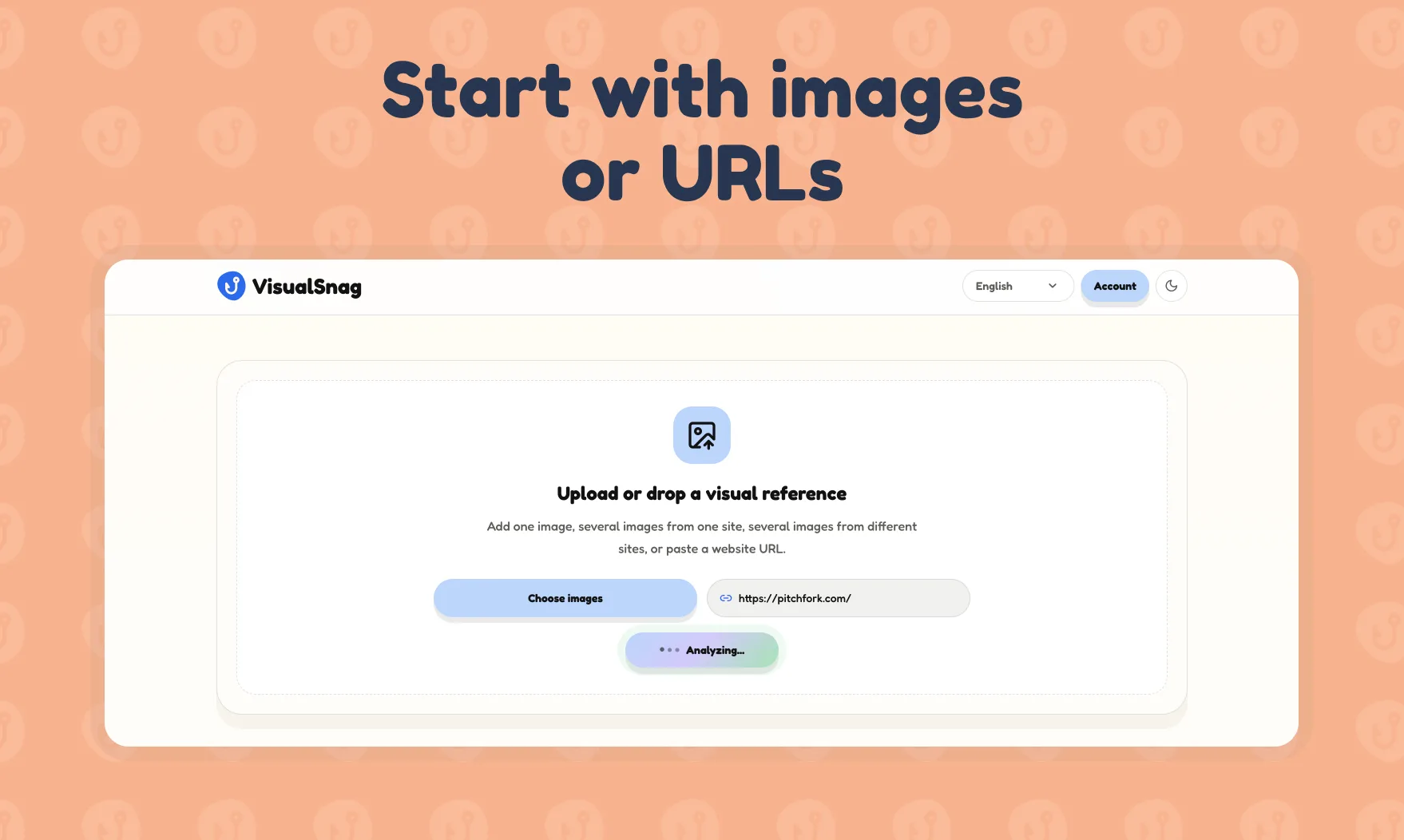
Upload a screenshot or paste a URL. Then review the output rather than accepting it blindly. The best result comes from keeping the useful rules and editing the parts that do not suit your brand.
Step 4: Convert the result into implementation-friendly tokens
For a small project, CSS variables are often the fastest format. For a larger product, you may want JSON tokens that can later feed Figma, Tailwind or a component library.
Here is a compact example:
:root {
–vs-color-bg: #F7F7F4;
–vs-color-surface: #FFFFFF;
–vs-color-ink: #1E2521;
–vs-color-muted: #68736C;
–vs-color-accent: #E56A45;
–vs-space-2: 8px;
–vs-space-4: 16px;
–vs-space-6: 24px;
–vs-radius-sm: 12px;
–vs-radius-lg: 24px;
–vs-shadow-card: 0 14px 36px rgba(30, 37, 33, 0.10);
}
Use names that describe purpose, not the page on which you first used them. --color-surface will survive a redesign; --pricing-card-white will not.
Step 5: Give the tokens to your AI coding tool
AI builders produce better interfaces when they receive a small, ordered design system before they receive a screen request. Put the tokens first, then explain the page goal, user and content hierarchy.
Example prompt:
Build an original SaaS dashboard using the design tokens below.
Use the color and spacing roles consistently. The UI should feel calm,
editorial and lightly rounded—not generic glassmorphism.
[paste tokens]
Create a project overview page with a left navigation, an activity card, three key metrics and a primary action. Use accessible contrast and responsive layout. Do not copy logos, copy or unique assets from the visual reference.
This gives the model both creative direction and implementation constraints.
Common mistakes when generating design tokens
Treating every visible value as a token
Tokens should simplify decisions. If your first file contains 70 colors and 18 shadows, it is probably a screenshot inventory rather than a reusable system.
Naming tokens by appearance only
blue-500 can be helpful in a low-level palette. But component code usually benefits from semantic names such as color.action.primary and color.text.muted.
Ignoring accessibility
A beautiful pale-gray text style may be unreadable in your own product. Check contrast for body text, buttons, inputs and error states before adopting a visual direction.
Asking AI to “make it like this” with no rules
A screenshot alone leaves too much ambiguity. Add the visual brief, token roles and layout intent so the output is consistent across future screens.
FAQ
Can a design tokens generator create a complete design system?
It can create a strong starting point, but a production design system also needs component states, accessibility checks, responsive rules, governance and real-world testing.
Can I generate design tokens from a screenshot?
Yes. A screenshot can reveal the visual hierarchy, palette, spacing rhythm, typography character and component treatment. You should still review the output and adapt it to your product.
Are CSS variables the same as design tokens?
CSS variables are one way to implement design tokens on the web. Tokens are the design decisions; CSS variables are a practical format for using them in code.
Which tools can use the output?
You can use the result as a brief for Cursor, Claude Code, Codex, Lovable, Bolt, v0, Figma Make or a developer working in CSS, Tailwind, React or another frontend stack.
Turn visual inspiration into a system you can build with
The fastest way to make AI-generated UI feel intentional is to define its visual rules before asking for a screen. Start with a reference, turn it into a concise token system, then use that system consistently.
Read More
[{"id":4680,"link":"https:\/\/typeswitch.net\/blog\/design-tokens-generator\/","name":"design-tokens-generator","thumbnail":{"url":"https:\/\/typeswitch.net\/wp-content\/uploads\/2026\/07\/visualsnag-catch-style-from-website-or-visual-reference.jpg","alt":"catch-style-from-website-or-visual-reference"},"title":"How to Generate Design Tokens From a Website Screenshot","postMeta":[],"author":{"name":"Babenko Maksym","link":"https:\/\/typeswitch.net\/blog\/author\/max-babenko\/"},"date":"\u041b\u0438\u043f 23, 2026","dateGMT":"2026-07-23 08:06:56","modifiedDate":"2026-07-23 08:30:46","modifiedDateGMT":"2026-07-23 08:30:46","commentCount":"0","commentStatus":"closed","categories":{"coma":"<a href=\"https:\/\/typeswitch.net\/blog\/category\/visualsnag\/\" rel=\"category tag\">VisualSnag<\/a>","space":"<a href=\"https:\/\/typeswitch.net\/blog\/category\/visualsnag\/\" rel=\"category tag\">VisualSnag<\/a>"},"taxonomies":{"post_tag":""},"readTime":{"min":6,"sec":34},"status":"publish","content":"Creating a consistent interface is much easier when visual decisions are written down as reusable rules. Those rules are called"},{"id":4524,"link":"https:\/\/typeswitch.net\/blog\/best-language-switcher-macos\/","name":"best-language-switcher-macos","thumbnail":{"url":"https:\/\/typeswitch.net\/wp-content\/uploads\/2024\/11\/Type-Switch-Personalize-Your-Button.png","alt":"Minimalist design of Type Switch app for language changes on macOS."},"title":"Best Language Switcher for macOS in 2026: Type Switch for Multilingual Typing","postMeta":[],"author":{"name":"Babenko Maksym","link":"https:\/\/typeswitch.net\/blog\/author\/max-babenko\/"},"date":"\u0422\u0440\u0430 17, 2026","dateGMT":"2026-05-17 13:47:43","modifiedDate":"2026-05-17 13:56:53","modifiedDateGMT":"2026-05-17 13:56:53","commentCount":"0","commentStatus":"closed","categories":{"coma":"<a href=\"https:\/\/typeswitch.net\/blog\/category\/uncategorized\/\" rel=\"category tag\">Uncategorized<\/a>","space":"<a href=\"https:\/\/typeswitch.net\/blog\/category\/uncategorized\/\" rel=\"category tag\">Uncategorized<\/a>"},"taxonomies":{"post_tag":""},"readTime":{"min":7,"sec":17},"status":"publish","content":"Working with multiple languages on your Mac should feel natural. But for many people, switching keyboard languages is still one"},{"id":4510,"link":"https:\/\/typeswitch.net\/blog\/best-developer-tools-macos-2026\/","name":"best-developer-tools-macos-2026","thumbnail":{"url":"https:\/\/typeswitch.net\/wp-content\/uploads\/2026\/05\/Preview_1_en.jpg","alt":"quick notes app for Mac"},"title":"Best Developer Tools for macOS in 2026: Essential Mac Apps for Coding","postMeta":[],"author":{"name":"Babenko Maksym","link":"https:\/\/typeswitch.net\/blog\/author\/max-babenko\/"},"date":"\u0422\u0440\u0430 17, 2026","dateGMT":"2026-05-17 07:32:59","modifiedDate":"2026-05-17 07:46:13","modifiedDateGMT":"2026-05-17 07:46:13","commentCount":"0","commentStatus":"closed","categories":{"coma":"<a href=\"https:\/\/typeswitch.net\/blog\/category\/uncategorized\/\" rel=\"category tag\">Uncategorized<\/a>","space":"<a href=\"https:\/\/typeswitch.net\/blog\/category\/uncategorized\/\" rel=\"category tag\">Uncategorized<\/a>"},"taxonomies":{"post_tag":""},"readTime":{"min":9,"sec":1},"status":"publish","content":"macOS is still one of the best environments for developers in 2026. You get a Unix-based system, strong hardware, great"},{"id":4402,"link":"https:\/\/typeswitch.net\/blog\/confluence-public-links-alternative\/","name":"confluence-public-links-alternative","thumbnail":{"url":"https:\/\/typeswitch.net\/wp-content\/uploads\/2026\/05\/Confluence-public-links-alternative.png","alt":"Illustration showing Confluence pages published to the public web with Public Pages for Confluence"},"title":"Confluence Public Links Alternative: Publish Pages with SEO, Branding and Custom Domains","postMeta":[],"author":{"name":"Babenko Maksym","link":"https:\/\/typeswitch.net\/blog\/author\/max-babenko\/"},"date":"\u0422\u0440\u0430 8, 2026","dateGMT":"2026-05-08 16:02:11","modifiedDate":"2026-05-08 17:59:18","modifiedDateGMT":"2026-05-08 17:59:18","commentCount":"0","commentStatus":"closed","categories":{"coma":"<a href=\"https:\/\/typeswitch.net\/blog\/category\/atlassian\/\" rel=\"category tag\">Atlassian<\/a>","space":"<a href=\"https:\/\/typeswitch.net\/blog\/category\/atlassian\/\" rel=\"category tag\">Atlassian<\/a>"},"taxonomies":{"post_tag":""},"readTime":{"min":7,"sec":27},"status":"publish","content":"By Maksym Babenko \u00b7 ~5 min read \u00b7 May 8, 2026 Confluence public links are useful when you need to share a page"}]